BioLife — A system of simplicity for a world that wants better.
BioLife didn’t need a brand story crafted from thin air — it already had a purpose built into its name. What it needed was clarity. A brand identity that brought together its clean, health- first approach with a visual system that felt precise, fresh, and effortlessly modern.
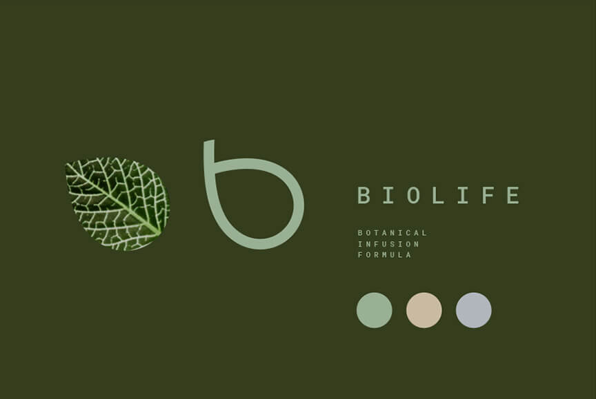
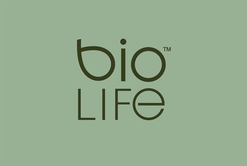
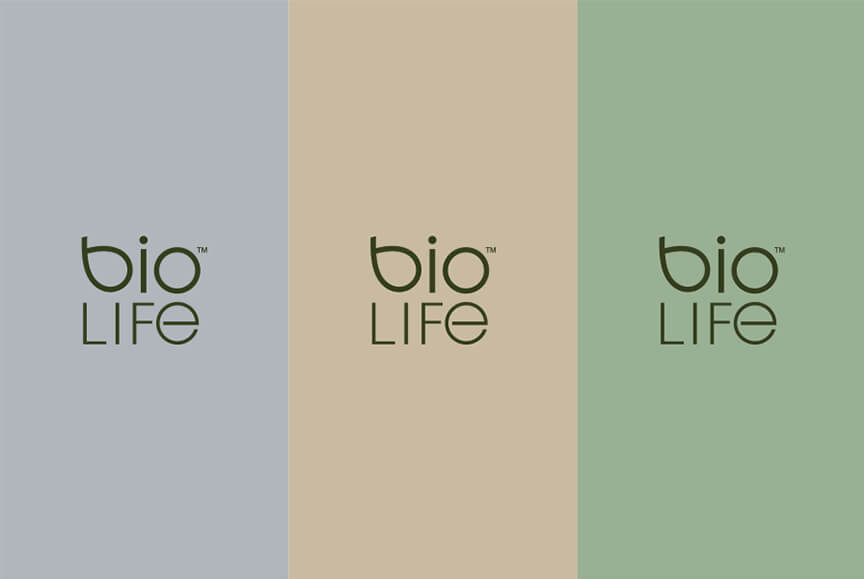
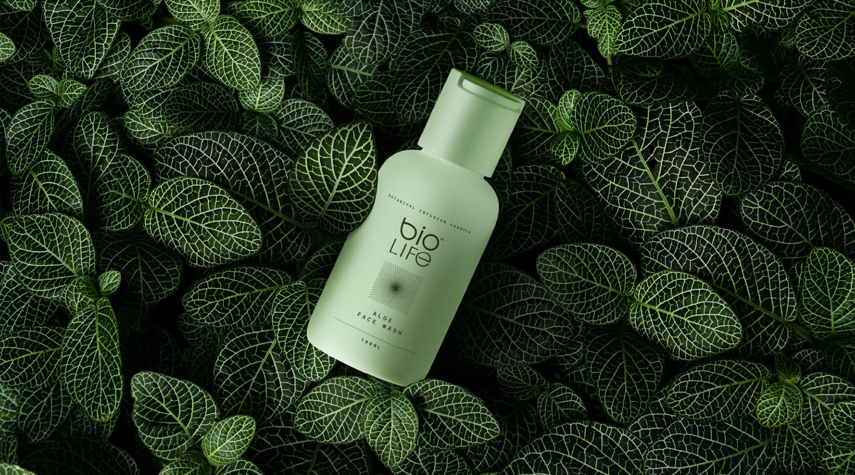
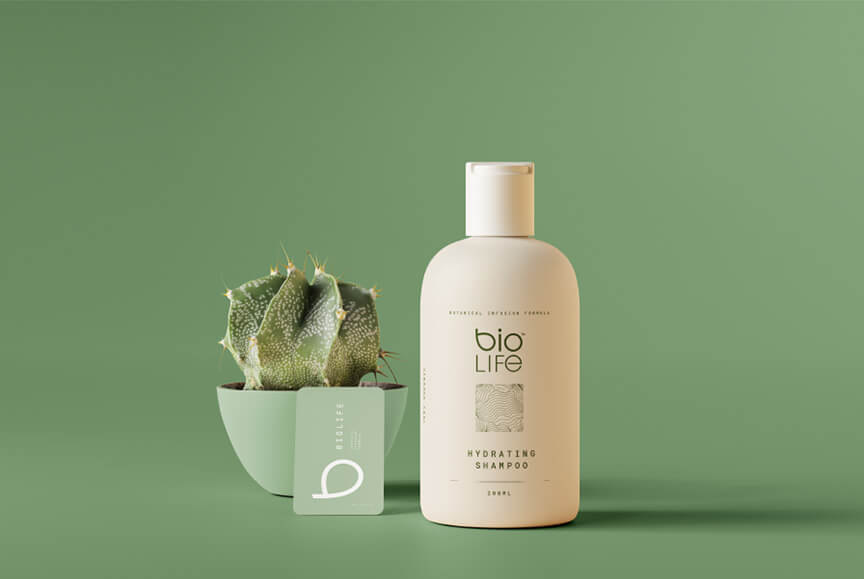
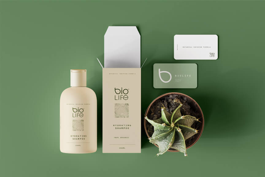
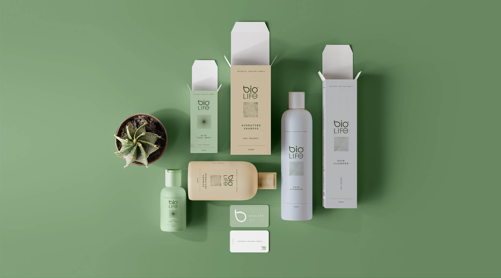
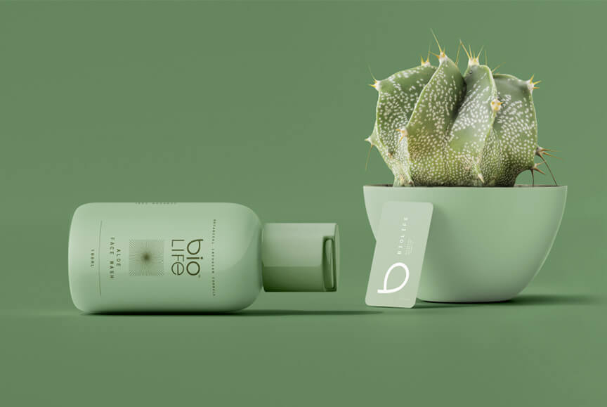
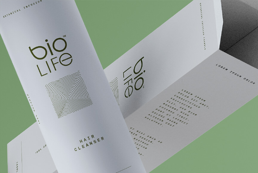
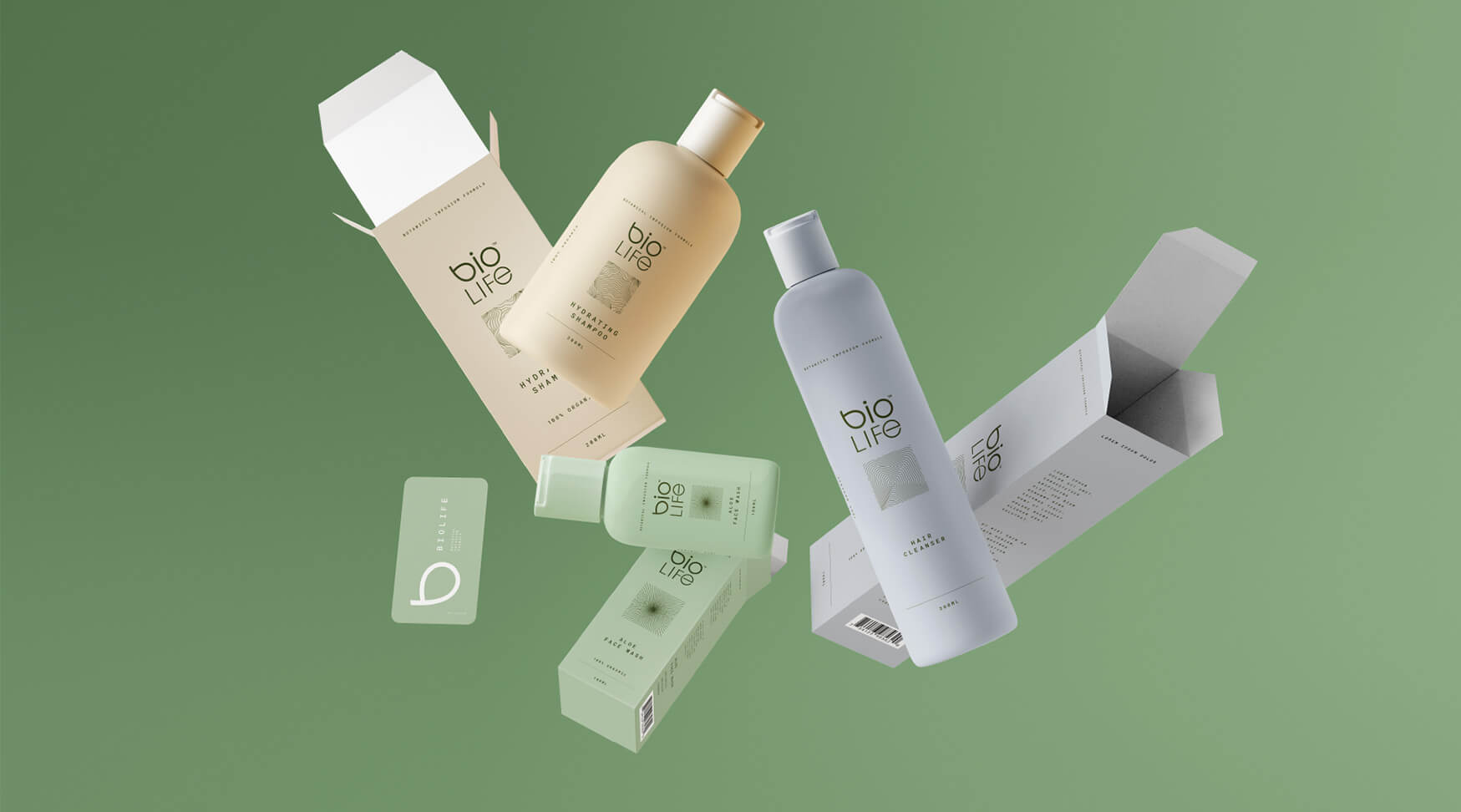
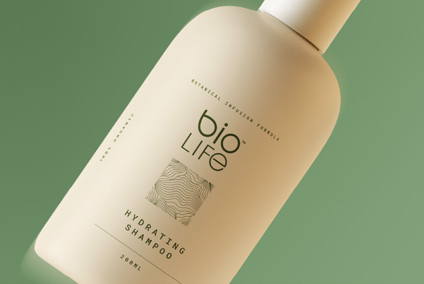
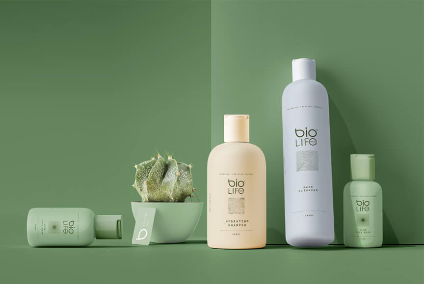
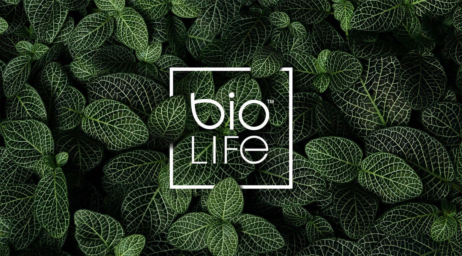
We built the BioLife identity to echo the principles of wellness: clarity, minimalism, and fluidity. The symbol — a distilled, geometric leaf — becomes the cornerstone of the brand’s fluency. Used in repetition, rotation, and subtle animation, it signals vitality without excess.
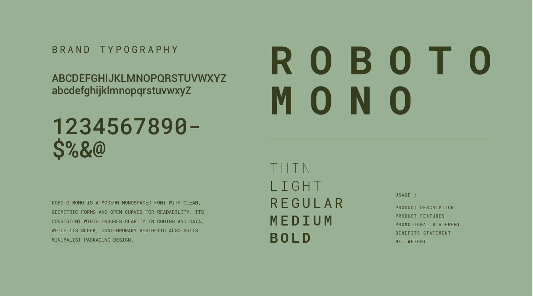
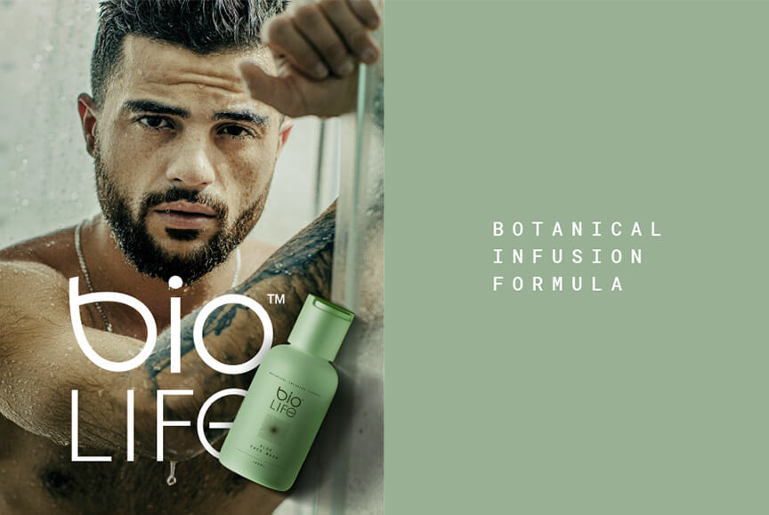
Typography is clean and modular. The colour palette leans into botanical greens and clinical whites, while custom iconography creates consistency across packaging, communications, and web. Every element is designed to reinforce a sense of trust, transparency, and gentle innovation.
BioLife doesn’t pretend to be revolutionary. It’s confident enough to be simple. And that’s what makes it stand out in a category full of overpromises.