Barbeque Nation – Where the grill is live, and the guest is king.
Barbeque Nation didn’t just bring the grill to the table — it brought theatre, generosity, and celebration to Indian dining. But with a brand system that had grown chaotic over time, it was time to distill the identity back to its core: the guest experience.
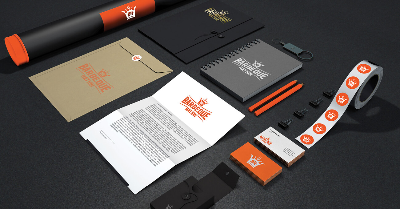
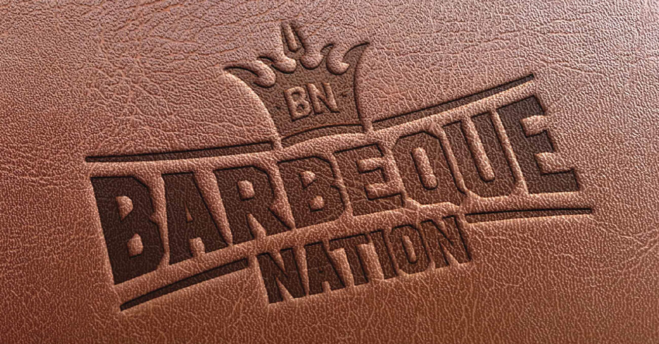
At the heart of our redesign was a single powerful truth: the guest is king. We turned this into a visual anchor — a crown, bold and unmistakable, that now sits proudly at the centre of the brand identity. More than a symbol, it became a statement — a cue for hospitality, attention, and respect.
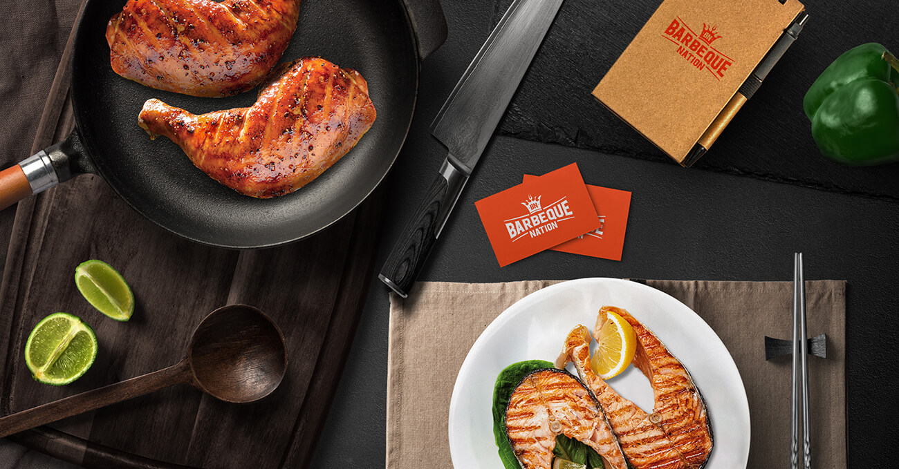
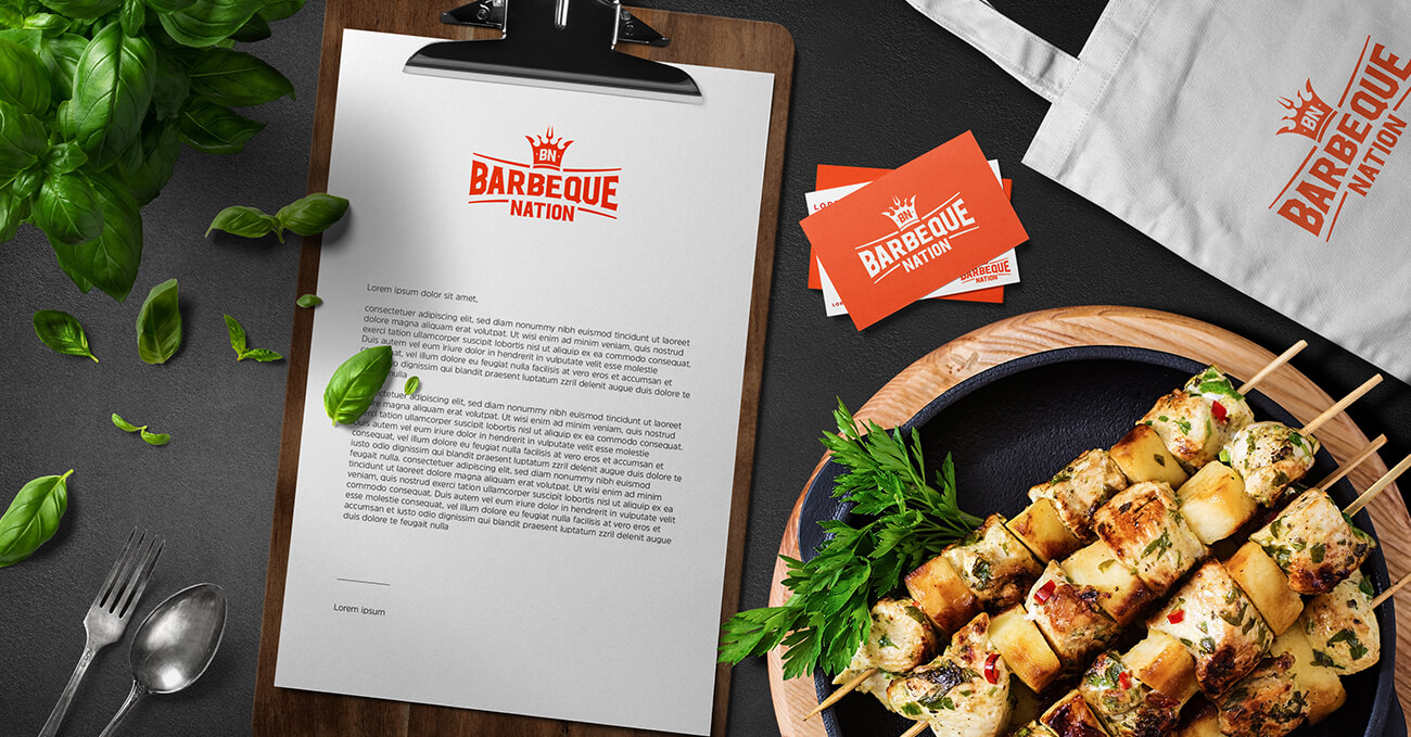
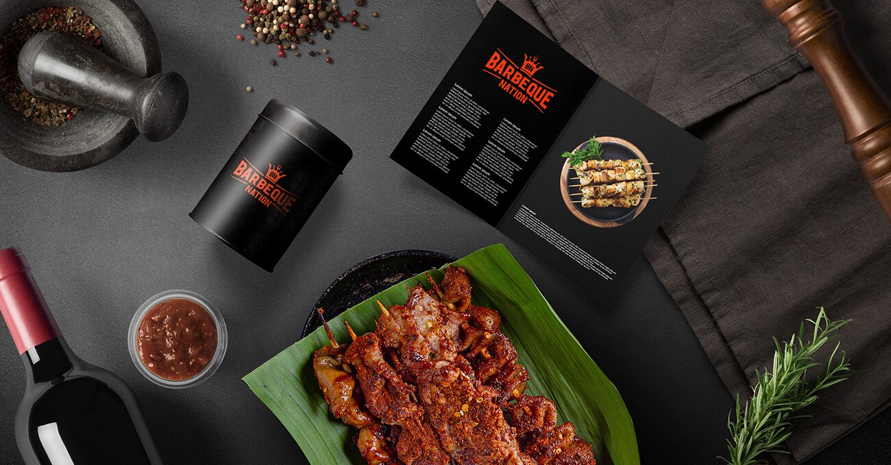
We retained the iconic flame but refined its edges, allowing it to coexist with the crown in a unified brandmark. The palette was warmed and deepened — reflecting both the richness of the food and the sense of indulgence the experience brings.
From signage to menus, table branding to digital experiences, the new design system elevates every touchpoint while staying fluent with what people already love. This wasn’t about rebranding Barbeque Nation. It was about restoring its royalty.