Cocosutra - From pantry staple to playful pleasure.
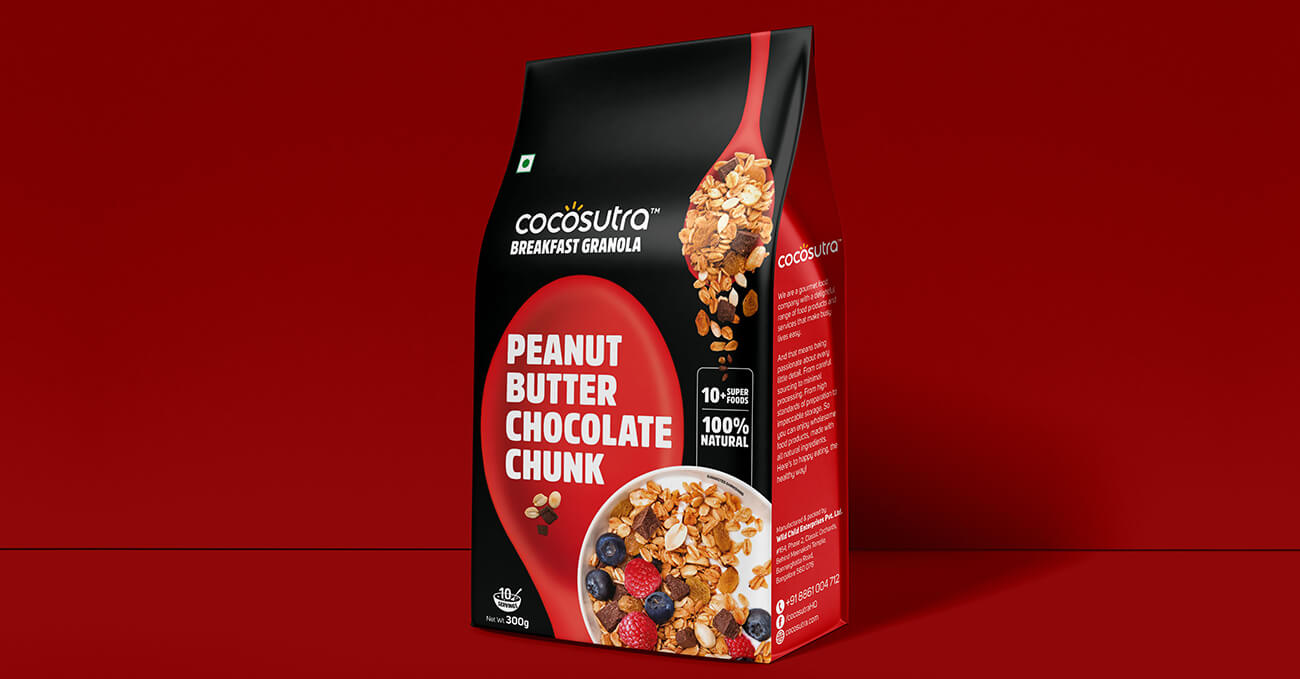
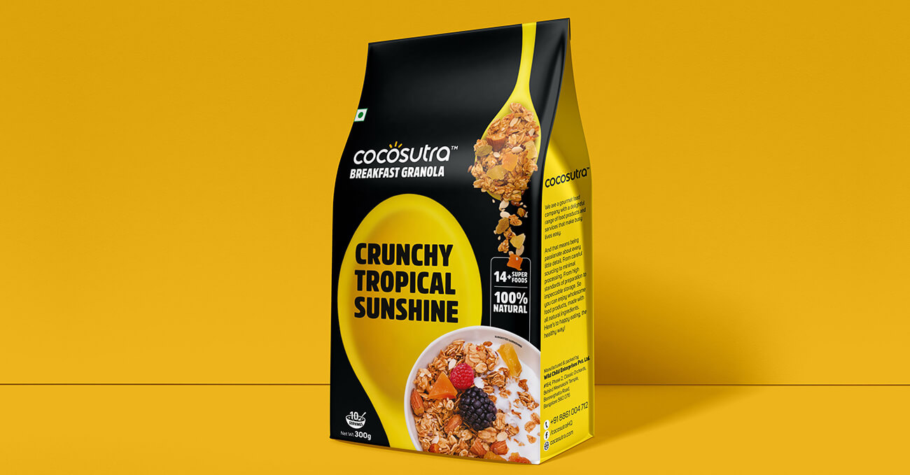
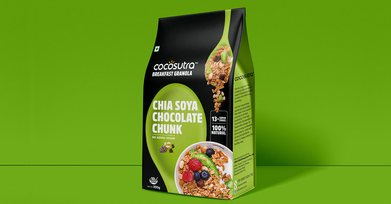
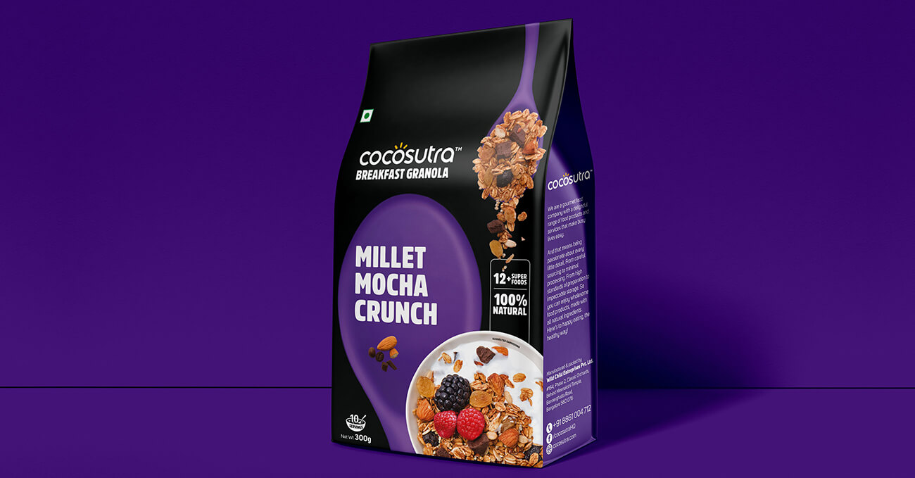
Cocosutra started as a clean-label, premium pantry brand. But over time, its product range evolved into something more indulgent — granolas, hot chocolates, and cookie doughs that made you feel like a kid in a health-conscious candy store. Our task was to evolve the identity to match this shift — without losing its credibility or coherence.
We retained the sophistication of the original wordmark but introduced a more playful visual world around it. Bright, food-inspired colours, bold typography, and light-hearted messaging made the packs pop — both on shelf and in people’s minds. We gave each product its own personality while maintaining a strong master brand architecture.
What emerged was an identity that felt confident, unprocessed, and joyfully real. Cocosutra became more than a label. It became an invitation — to scoop, stir, bite, and grin.