Khadims — From discount-driven to everyday dependable.
Khadim’s has long been a household name in affordable Indian footwear. But the brand had
lost ground to newer players, and its identity felt fragmented — stuck somewhere between
mass-market and mid-premium, unsure of how to speak to the next generation of Indian
families.
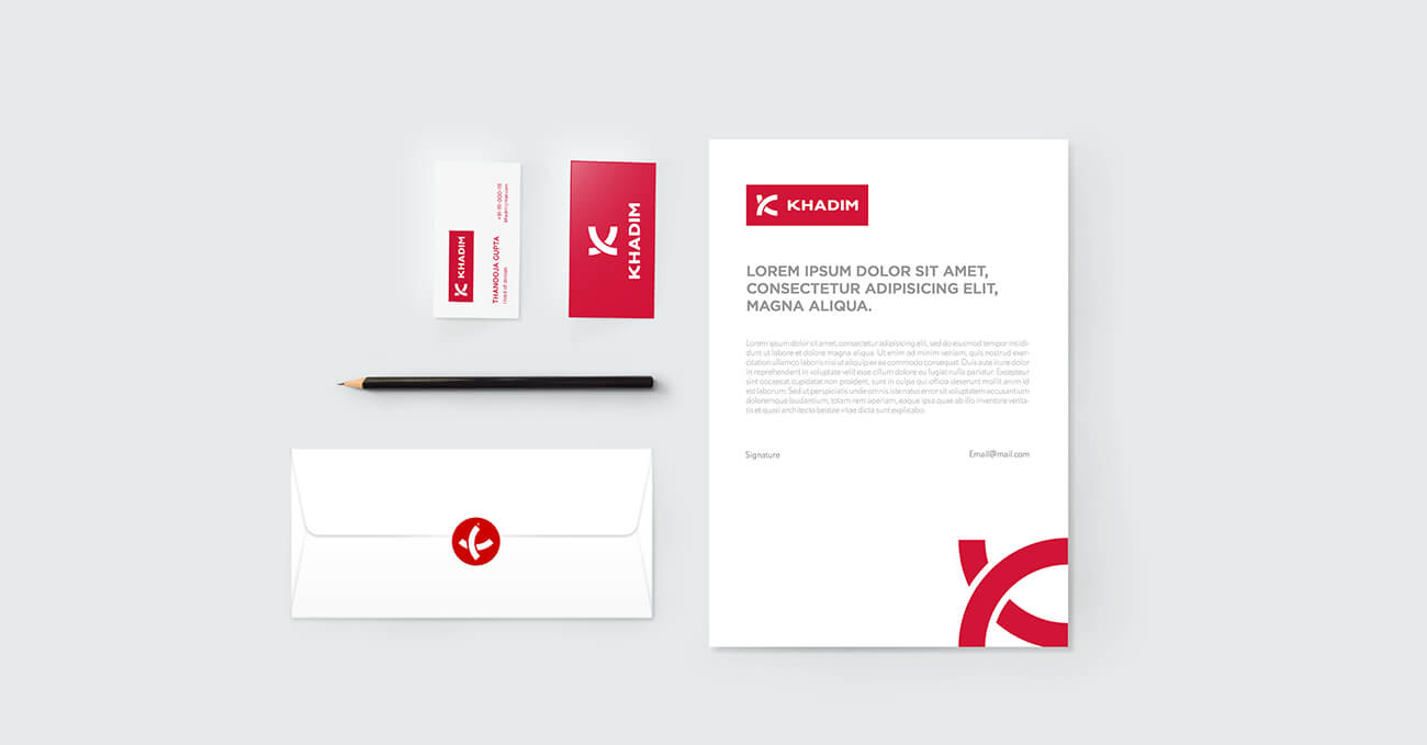
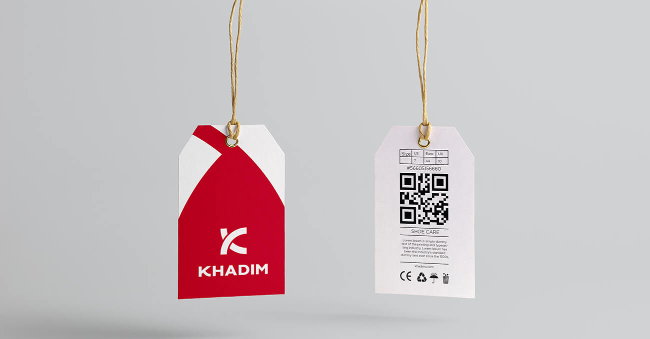
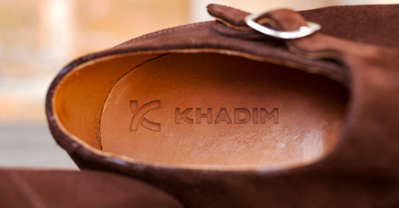
Our mandate was to retain trust while rebuilding relevance. We started by crafting a new
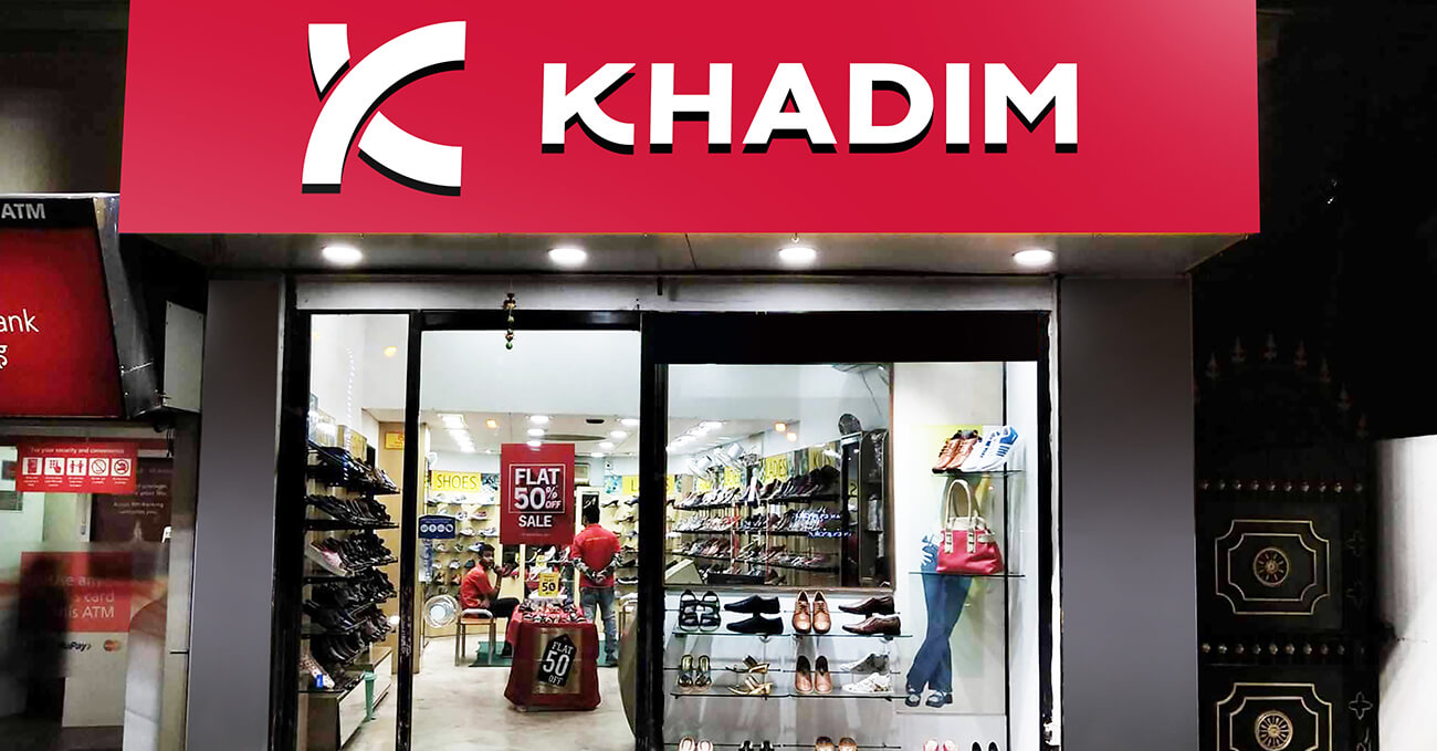
logotype — cleaner, more balanced, and designed to work across physical signage, product
tags, and digital thumbnails. We introduced a confident red, softened with modern neutrals,
and built a visual system rooted in approachability and structure.
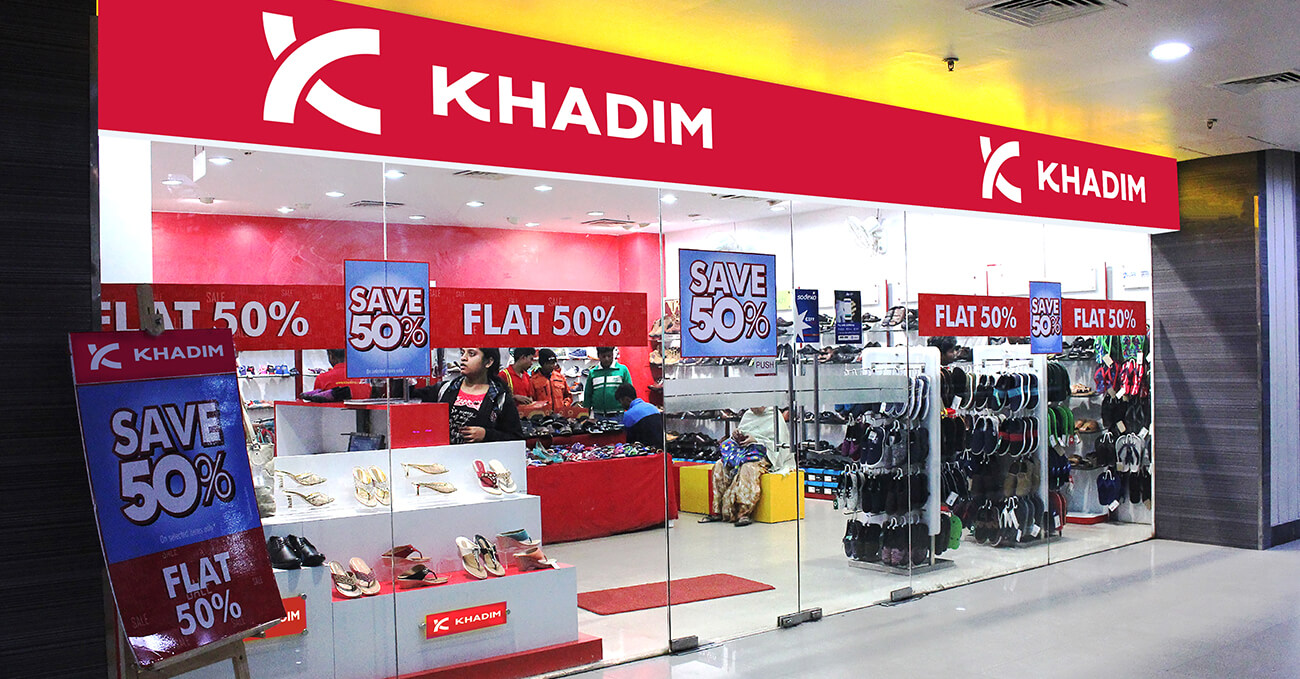
Retail graphics were redesigned for modular storytelling — showcasing value without
screaming price. Campaign language shifted from transactional to emotionally everyday:
shoes that feel right, look right, and last longer than you’d expect.
This wasn’t just a cosmetic change. It was a repositioning from “affordable” to “accessible.”
Khadim’s didn’t become something new — it became more sure of who it is.