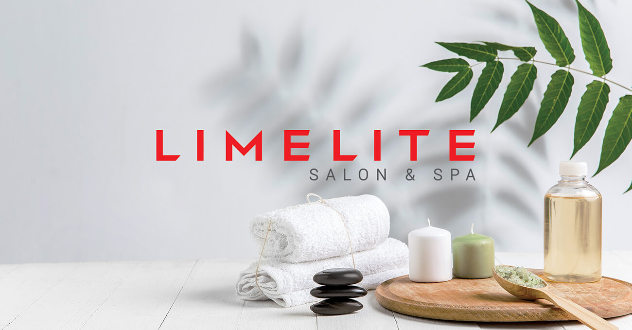
Limelite – A salon brand identity that owns its glow.
Limelite has long been known as a dependable neighbourhood salon chain. But with a
changing customer base and increasing competition, it needed to step out of the shadows and
shine — literally. Our task was to reimagine the identity to reflect modern aspiration while
retaining its mass-friendly, approachable core.
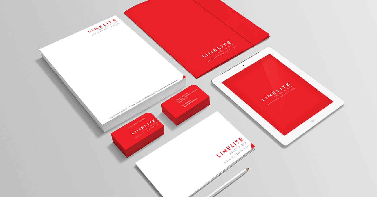
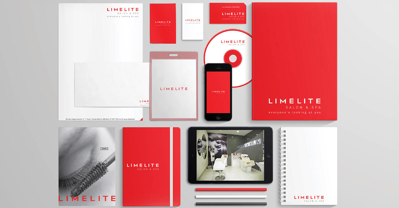
We built the brand around the concept of light. The logotype glows with subtle gradients, soft
curves, and a rhythm that feels fluid — like movement across a mirror. The new colour
palette combines warm neutrals with bursts of lime gold, creating a feeling of effortless
radiance.
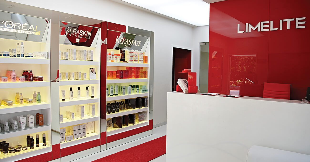
Supporting icons and interior graphics extend this metaphor — halo-like forms, diffused
textures, and spatial geometry designed to feel inviting, not intimidating. The result is a salon
identity that feels elevated, yet accessible. Professional, but never clinical. Limelite no longer
just offers services. It delivers a feeling you carry out with you.