Ovum Hospital – Designing a hospital brand that inspires trust, not fear.
Ovum is a women and children’s hospital — and one of the few in its category to truly
understand the role design can play in reducing patient anxiety. Our challenge was to build an
identity system that didn’t feel clinical or cold, but also avoided going too soft or sentimental.
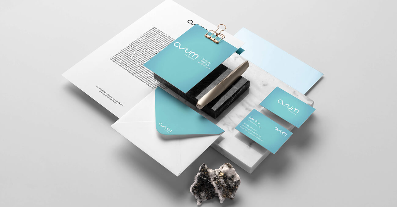
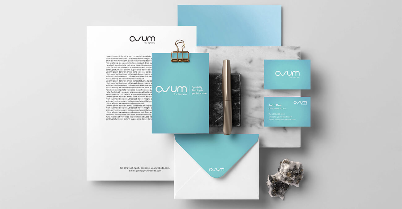
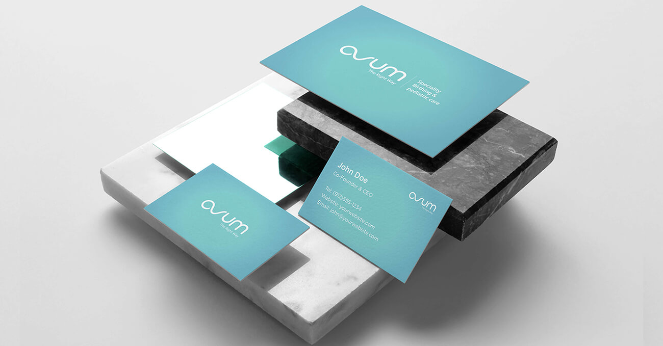
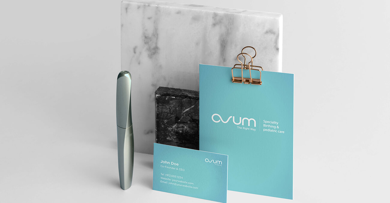
We chose a confident, contemporary teal as the core colour — clean, calming, and distinct in
the hospital landscape. The logotype is geometric yet rounded, evoking care and structure in
equal measure. Layouts use wide margins and generous breathing room to support clarity and
calmness across signage, stationery, and digital screens.
Rather than default to motherhood clichés, we focused on clarity, consistency, and dignity
— making Ovum’s visual language feel as considered as its care.


