Cocoon – The calmest voice in the room.
Cocoon is a boutique HR consultancy that believes transformation doesn’t have to be loud. It works quietly, deeply, and collaboratively — helping individuals and organizations emerge stronger and more aligned. The brand needed to reflect that rare combination of empathy, intelligence, and restraint.
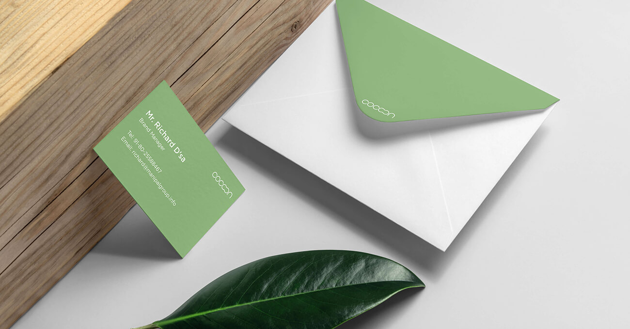
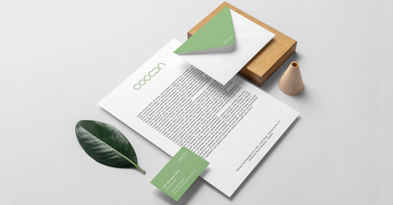
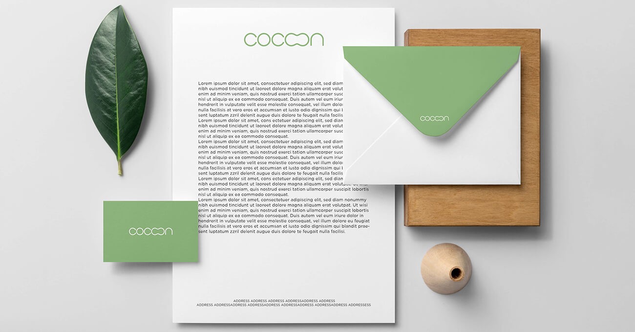
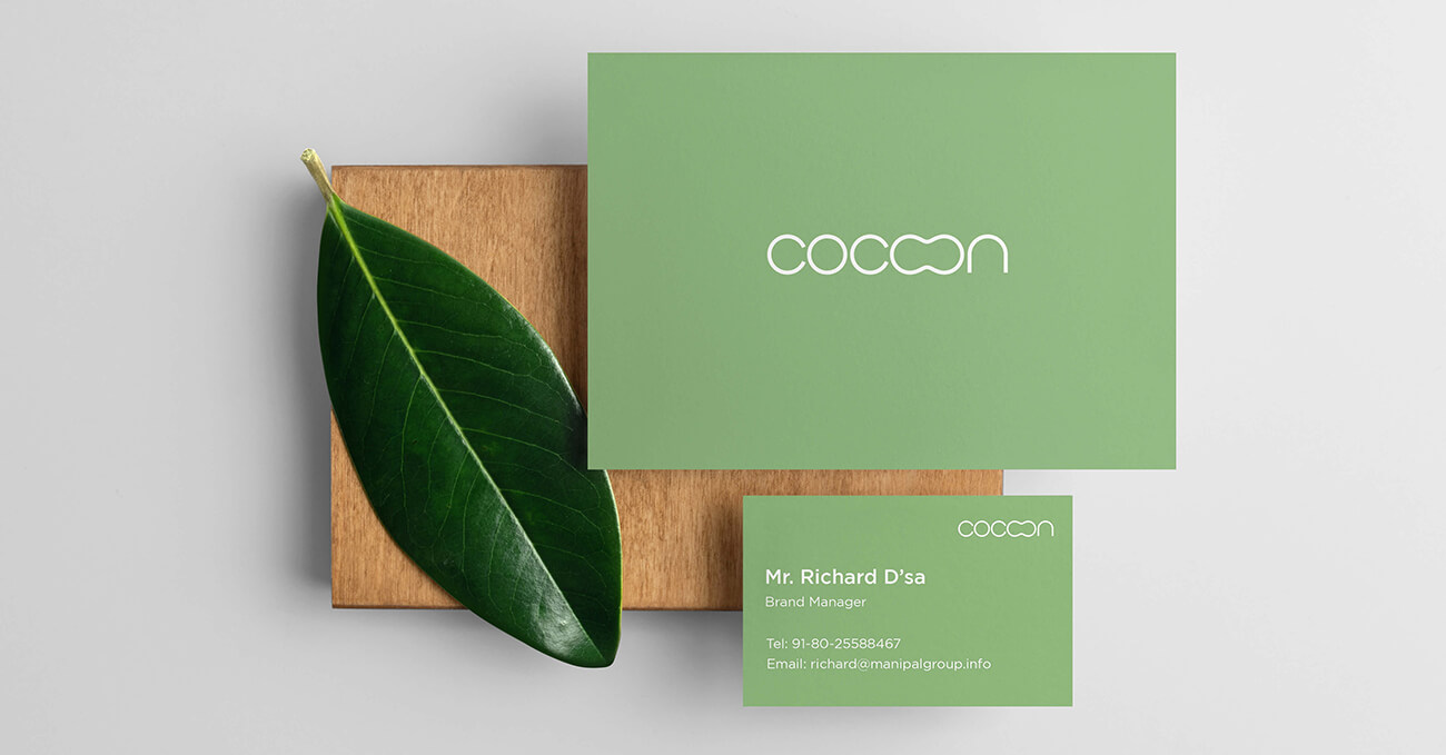
We built the identity around space — both visual and emotional. The logotype is light, confident, and spaciously set, allowing every letter to breathe. The colour palette is neutral and calming — soft greys, warm creams, and earthy taupes that signal quiet authority.
Typography was chosen for its warmth and clarity, while graphic elements suggest openness and listening. Every design choice is meant to feel human, intentional, and trustworthy.Cocoon’s identity doesn’t speak over you. It invites you in. And that’s what makes it powerful.