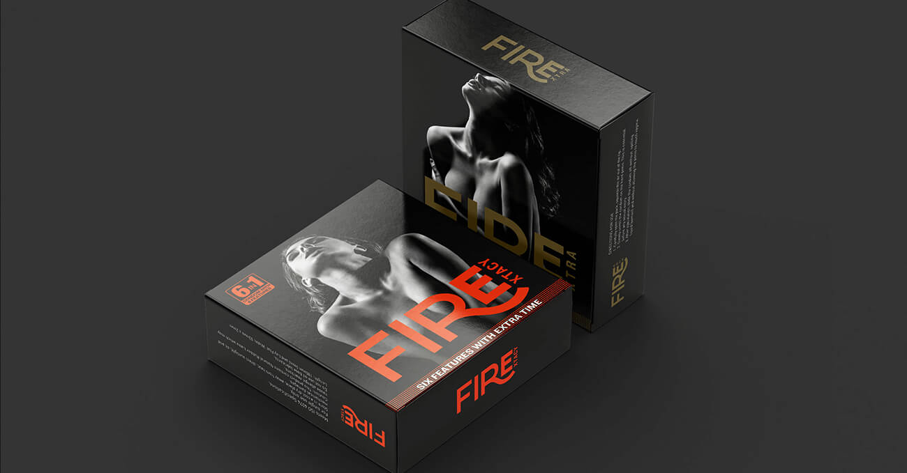
Fire – A brand that brings boldness to the bedroom.
Fire is a condom brand that speaks to a younger audience with more agency, more humour,
and far less awkwardness. The name is direct. The intent is clear. But the brand needed a
visual language that could turn confidence into connection — without crossing into crass.
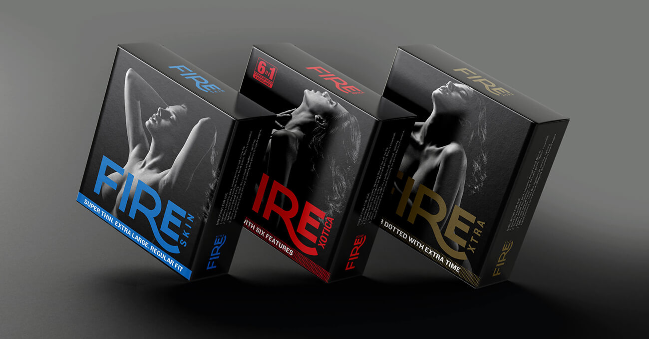
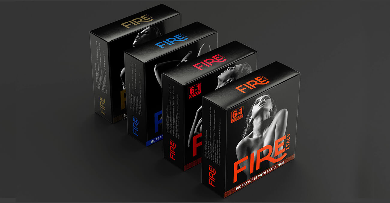
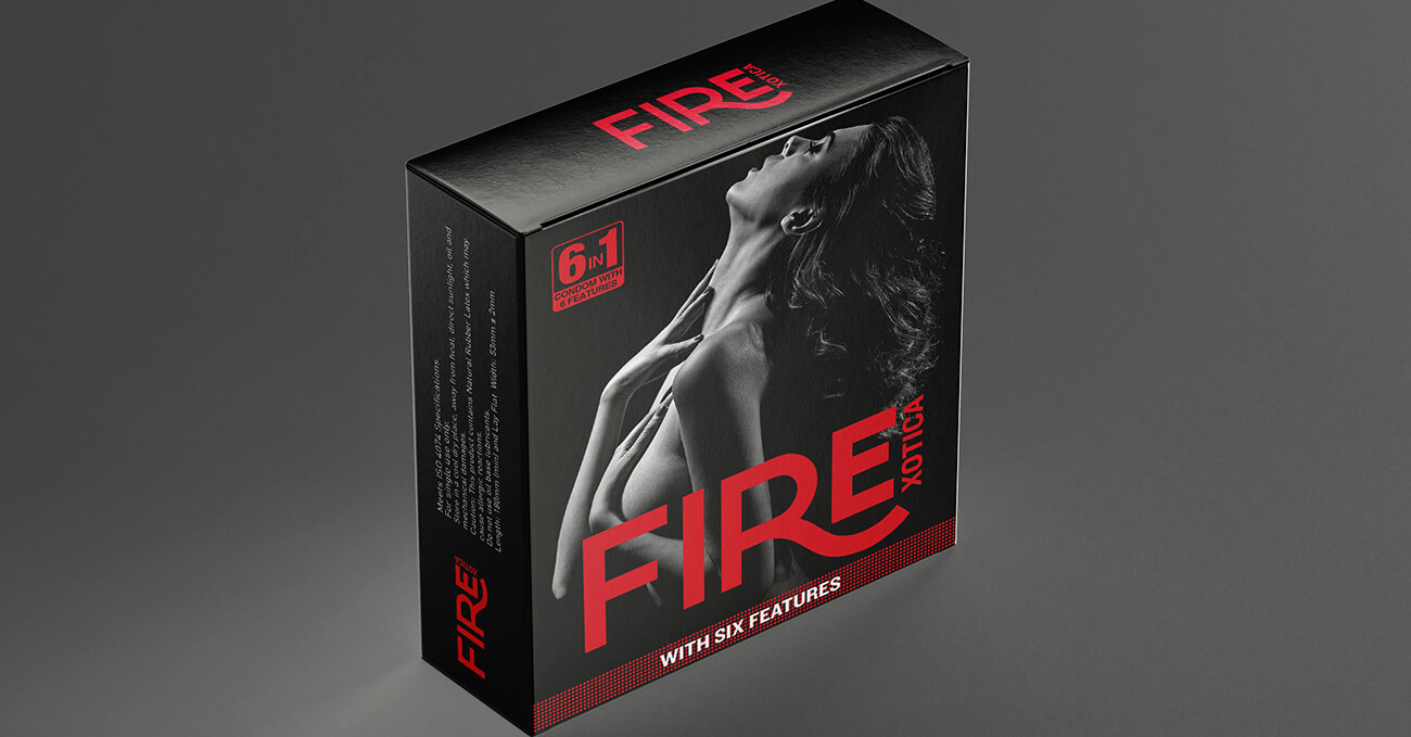
We built Fire around the idea of spark — as ignition, flirtation, and chemistry. The logo is
sharp and dynamic, evoking motion and heat. The pack system uses vibrant, irreverent
colourways and playful icons to cue flavour, variant, and personality.
Every detail is designed to remove hesitation. To make buying a condom feel like a choice —
not a chore. And in a category that usually tiptoes, Fire walks in with a grin and a wink.