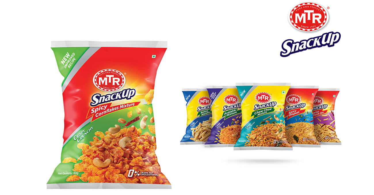
MTR SnackUp – Bringing South India to the snack aisle.
MTR SnackUp is a line of ready-to-eat South Indian savouries — crunchy, authentic, and full
of regional pride. But most packaging in this space tends to veer either generic or hyper-
traditional. Our job was to give MTR SnackUp a fresh, mainstream-ready identity without
diluting its origin.
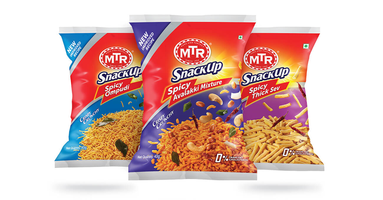
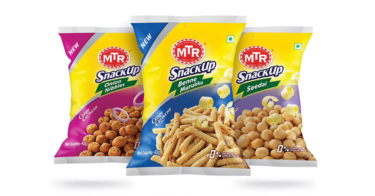
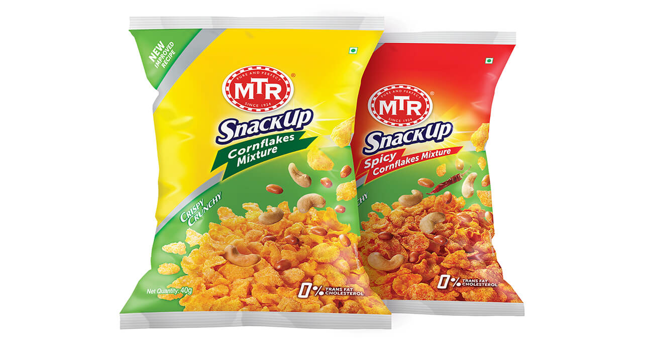
The design language is bold, modern, and unapologetically Indian. A deep crimson backdrop
anchors the pack, while high-contrast product photography shows the snacks in their crisp,
golden glory. Clean typographic hierarchy ensures variant clarity and navigability across
formats. Subtle South Indian motifs — temple silhouettes, kolam lines — are worked in with
restraint, allowing heritage to whisper rather than shout.
MTR SnackUp doesn’t try to reinvent the snack. It simply presents it like it deserves to be
seen — front and centre, with pride.