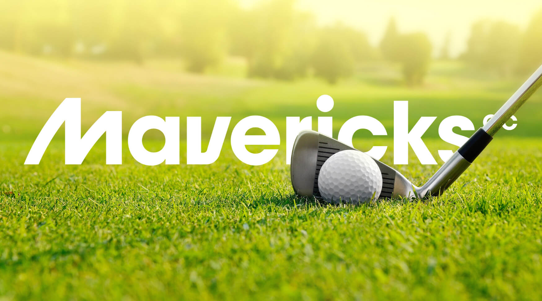
Mavericks — A team built on swagger, strategy, and the sweet sound of a swing.
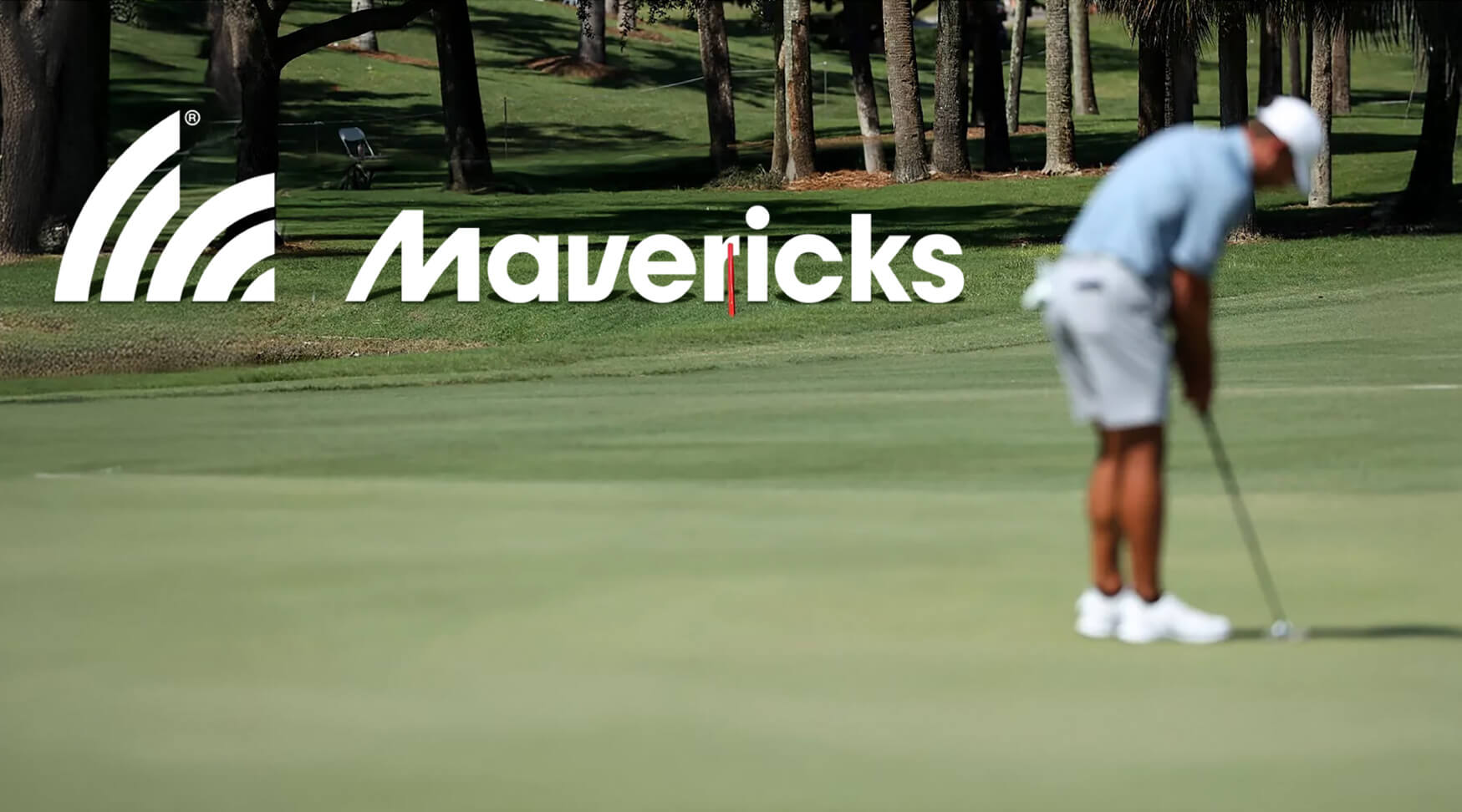
Golf isn’t just a game of precision — it’s a stage for personality. Mavericks was born as a competitive golf team, but it needed an identity that looked nothing like traditional golf brands. This was a team with edge. With instinct. With a chip on its shoulder and charm in its grip.
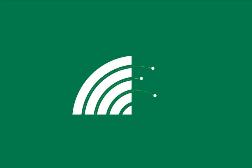
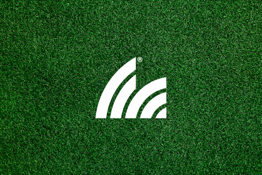
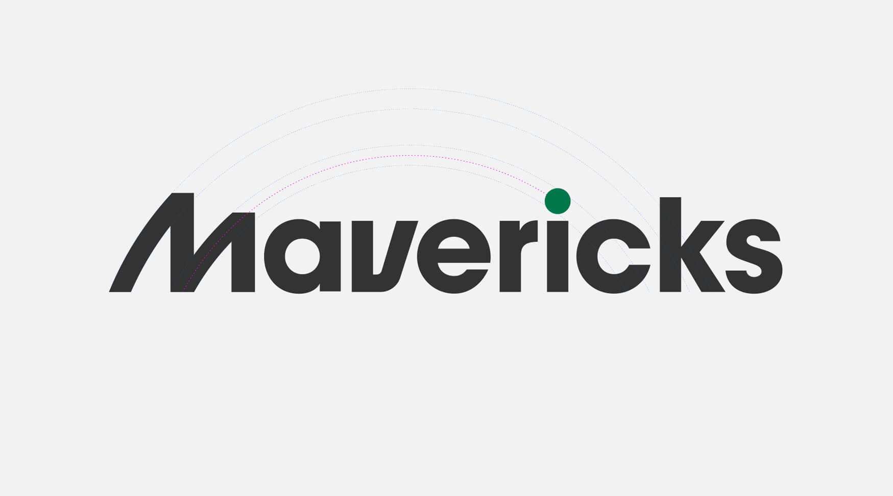
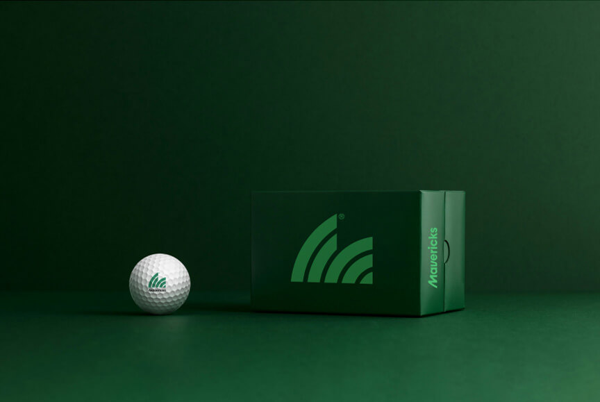
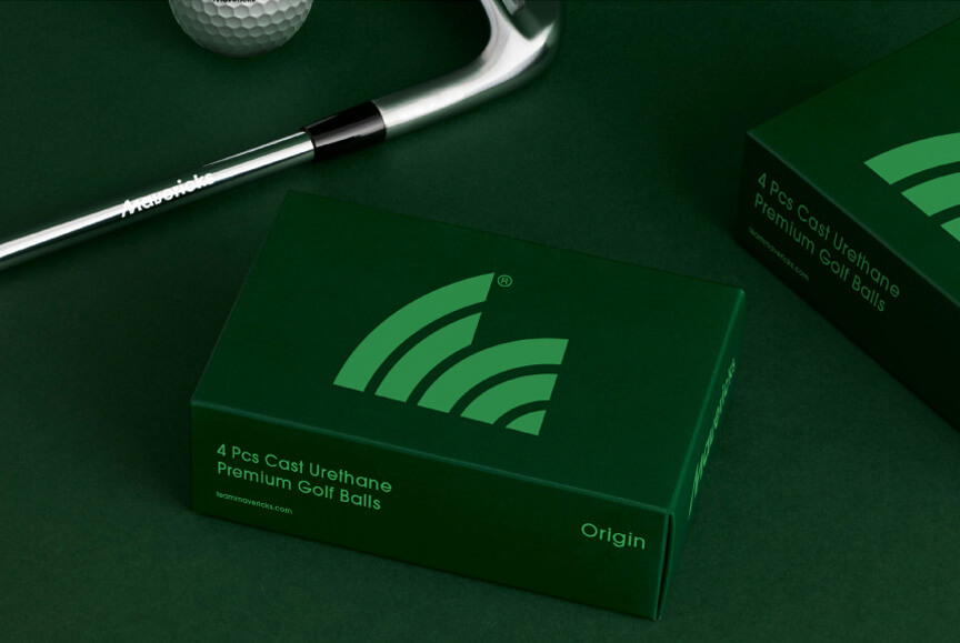
We designed the Mavericks identity to feel kinetic, confident, and a little dangerous. The symbol — a sharp, directional form inspired by flight paths and golf trajectories — looks like motion mid-swing. The logotype balances modernity with attitude, striking a line between team spirit and individual flair.
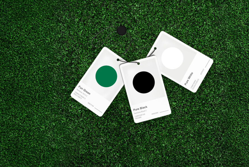
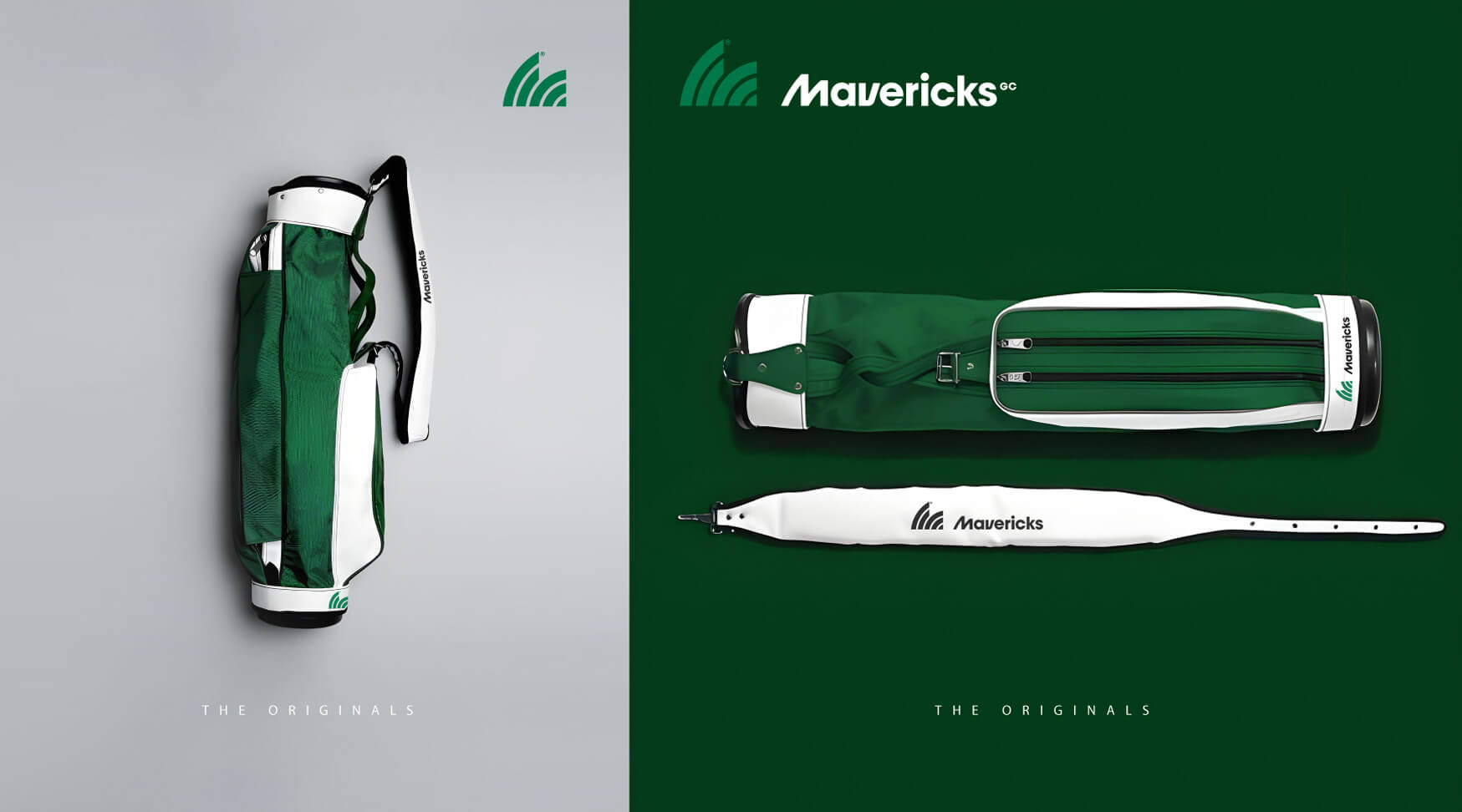
Electric neons meet deep field greens, creating a palette that’s anything but country-club conservative. Custom iconography and apparel applications were designed for both on-course intimidation and off-course swagger. This wasn’t just a team. It was a brand of its own. And every piece of it was made to stand out on scorecards and Instagram grids alike.