pichu — Where imperfection becomes identity.
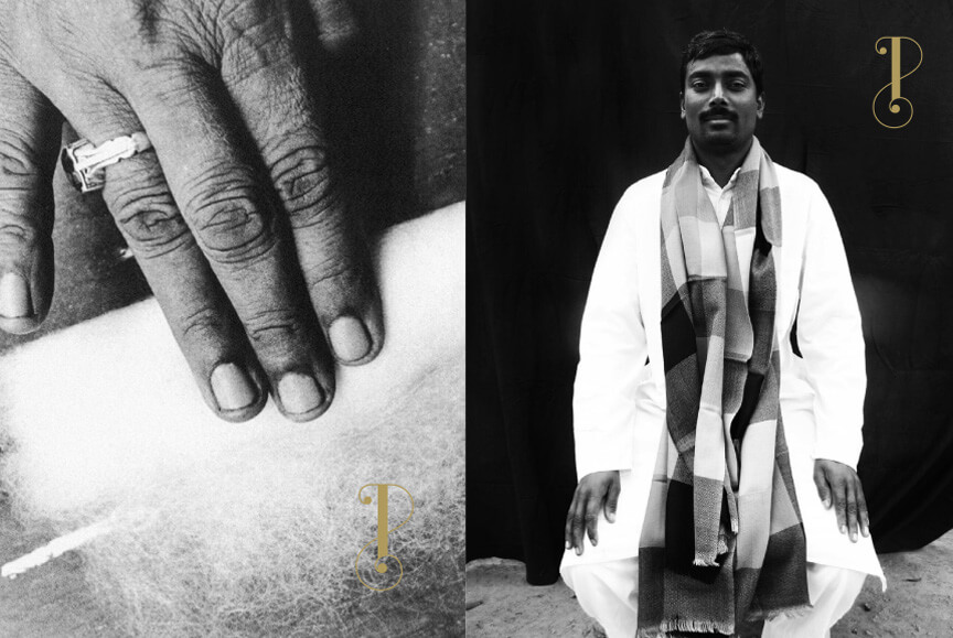
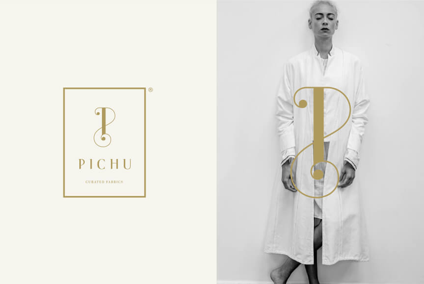
Pichu began as a whisper — a fashion label shaped by the Japanese philosophy of Wabi Sabi, where beauty is found in the imperfect, the transient, and the incomplete. Our challenge was to translate that delicate sensibility into a visual identity that felt both rooted and relevant — quiet, yet impossible to ignore.
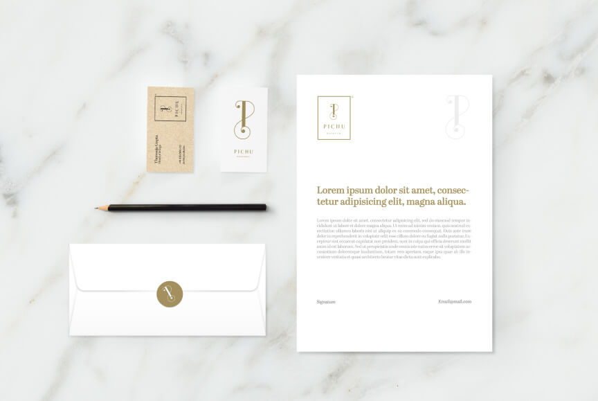
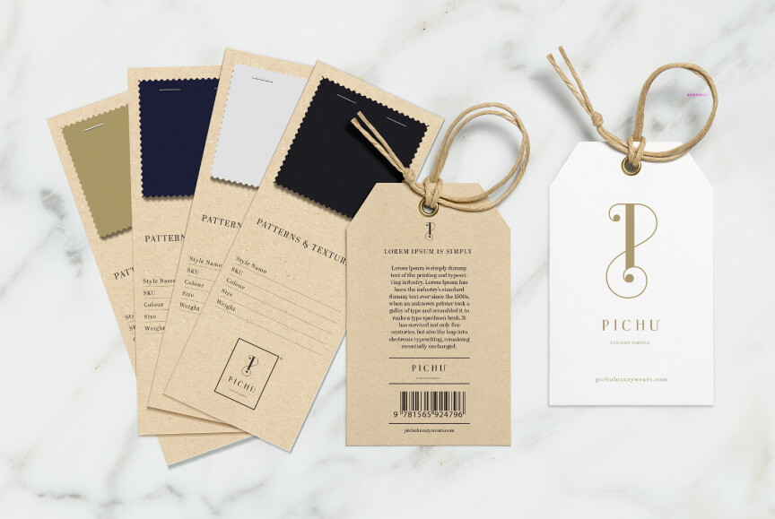
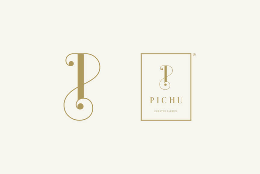
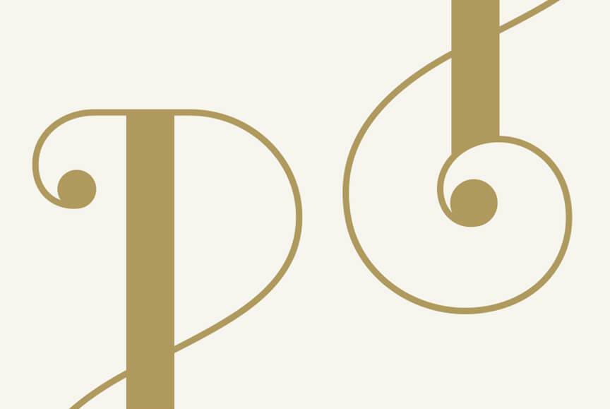
We started by crafting a symbol that holds the tension of symmetry and irregularity — a form that suggests balance, while allowing for asymmetry to breathe. The wordmark was drawn with purposeful restraint: soft curves balanced by fractured joins, echoing the idea that no two pieces — or people — are ever truly alike.
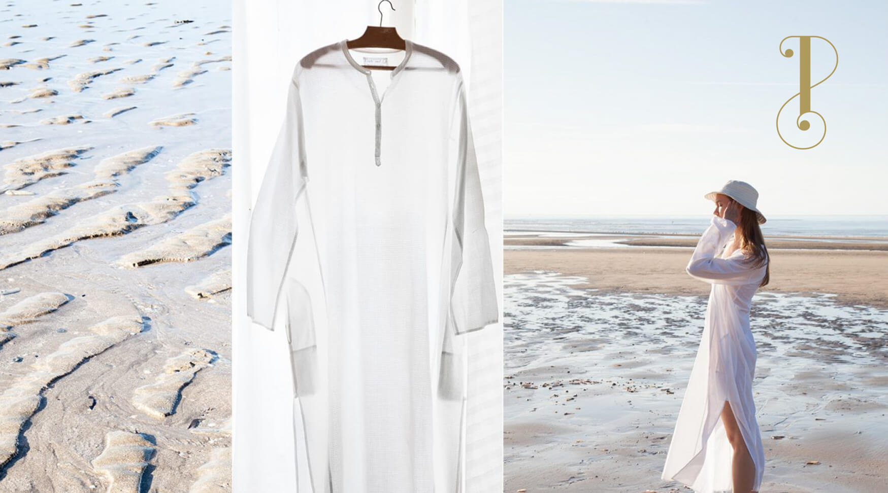
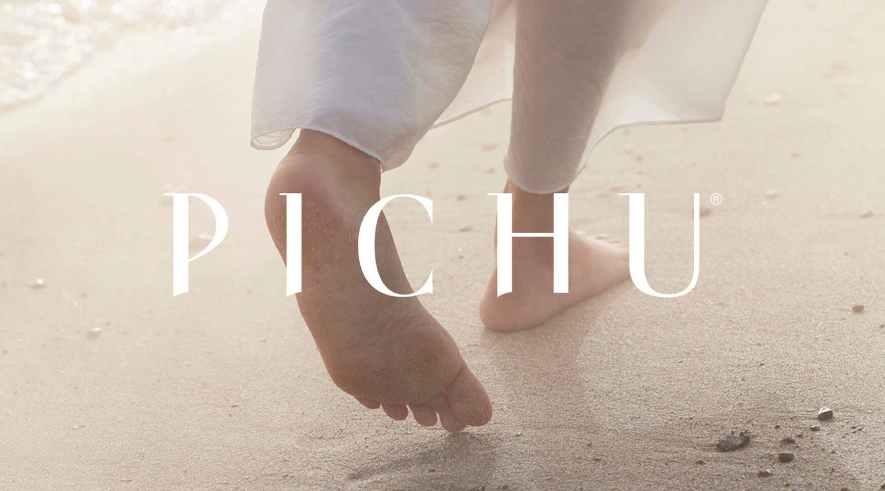
The palette is muted, natural, and deeply tactile — like sun-faded linen or river stones. Everything, from the packaging to the typography to the way space is held in layouts, reflects a quiet confidence. Pichu isn’t a brand that shouts. It is one that stays. And the identity we created makes that silence feel powerful.